| We've all been in period product aisles, either for yourself or someone you know. Pink and highly feminine designs everywhere. A problem I decided to solve with my campaign project is the invisibility that trans men, trans masculine people and/or nonbinary people who menstruate face when walking the aisles for the things they need. In comes Clarity. The period product for EVERYONE. This mock up of a campaign for the product advertises to a wide range of demographics in all gender(s) or lack thereof, but they all share one thing: they need period supplies. Be they cis woman, trans man, trans masculine, or nonbinary, we have what they need to continue their life with ease and Clarity. |
|---|
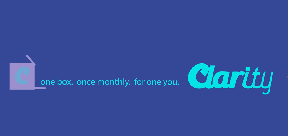
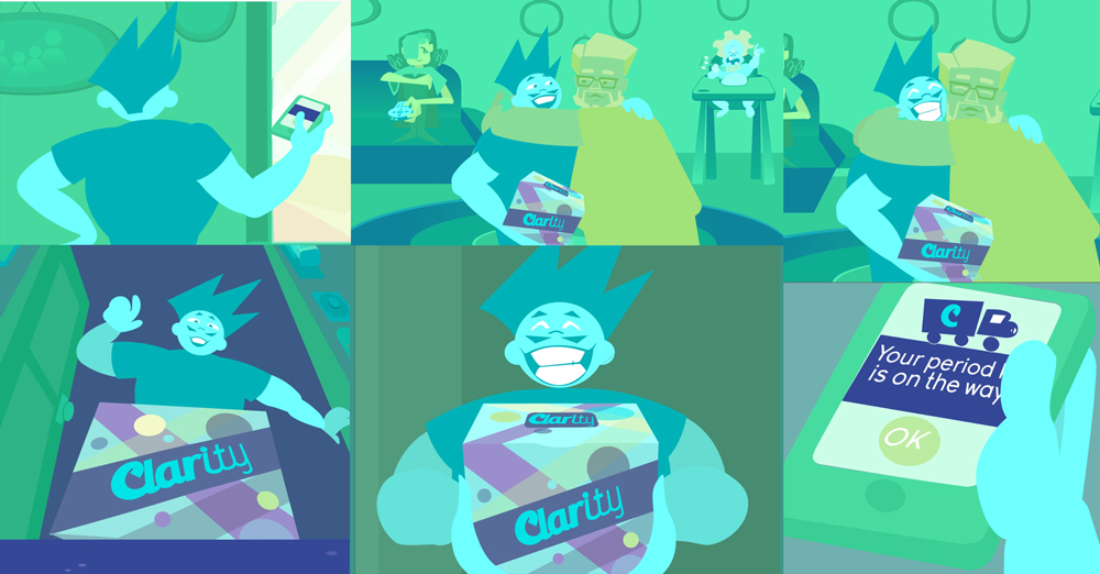
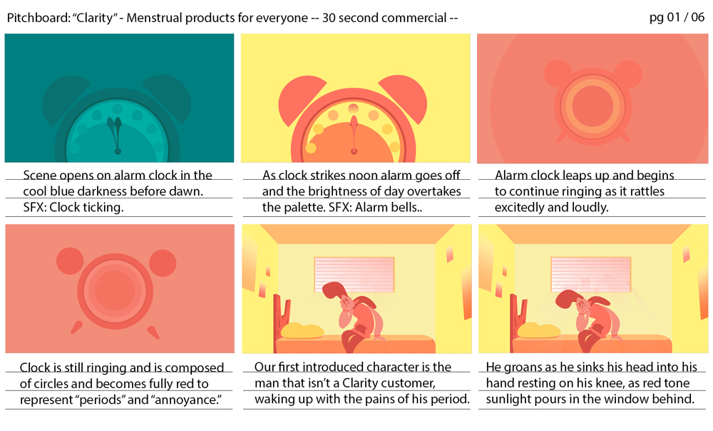
'Clarity' 30 sec advertisement for period kit delivery once a month.
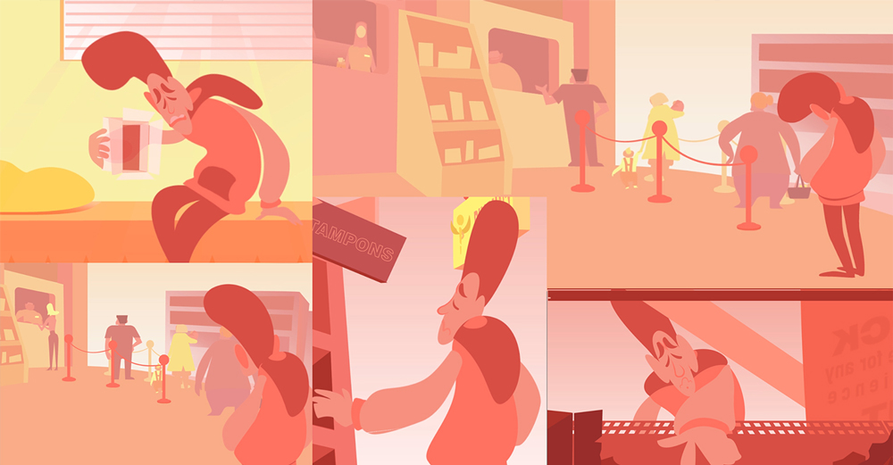
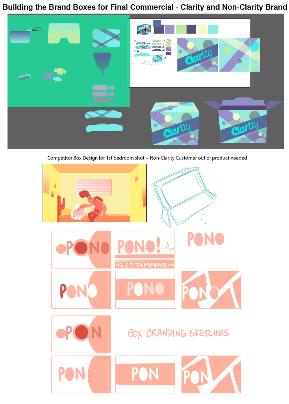
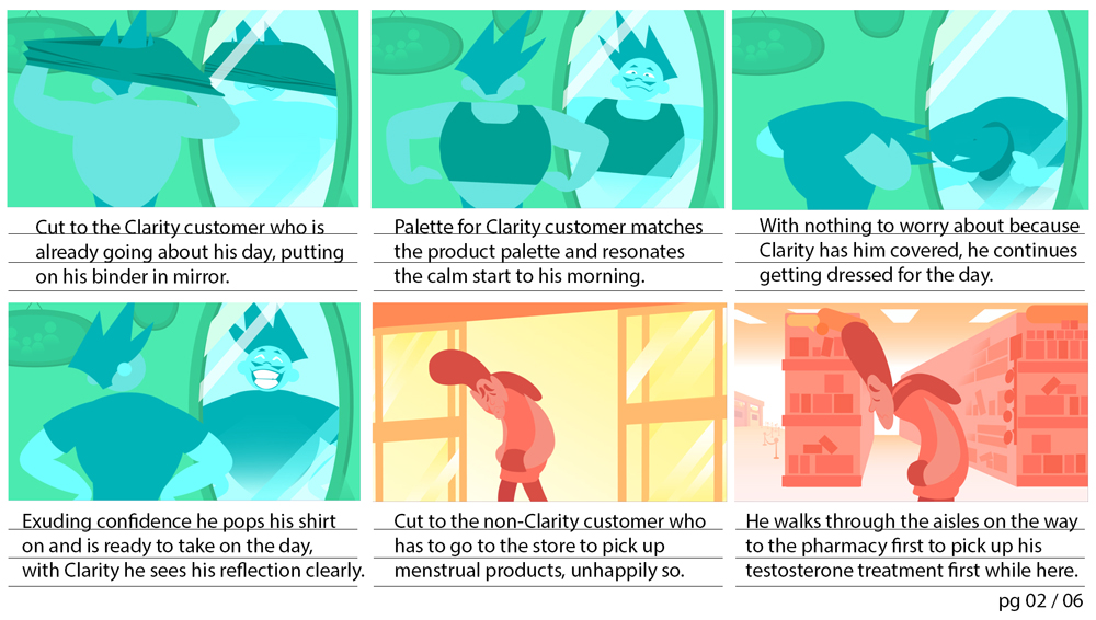
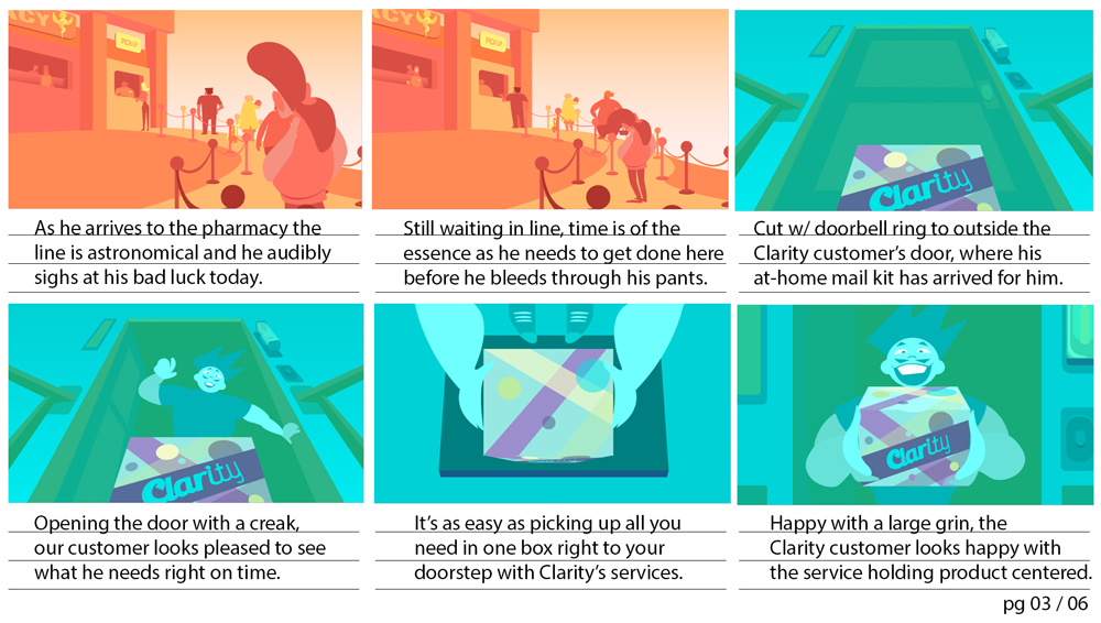
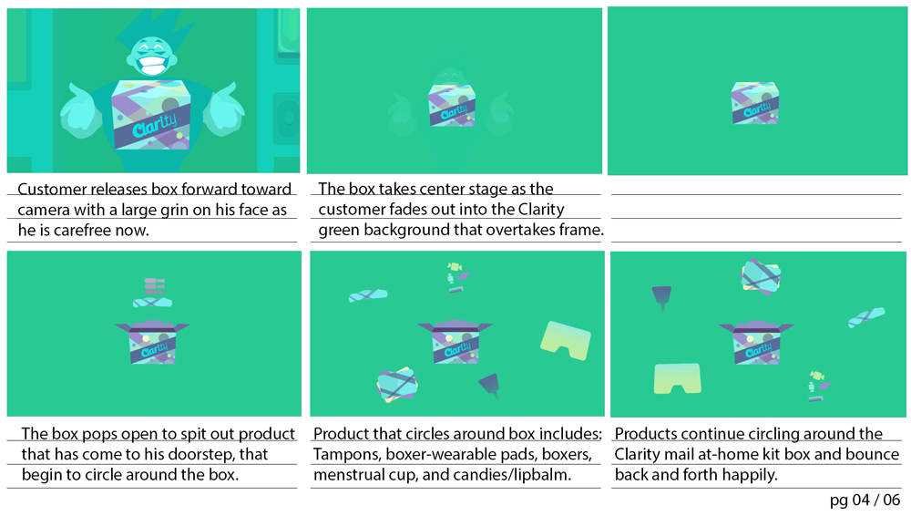
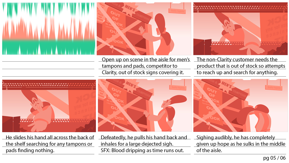
Non-Clarity customer versus Clarity customer experiences.
 |
 |
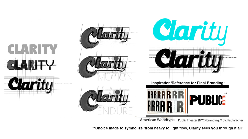
NavigationBranding DesignPackage Design Survey and Demographic Pitch Boards Character Design Animatic Colour Script Extra Process Storyboards Collateral |
 |
 |
 |
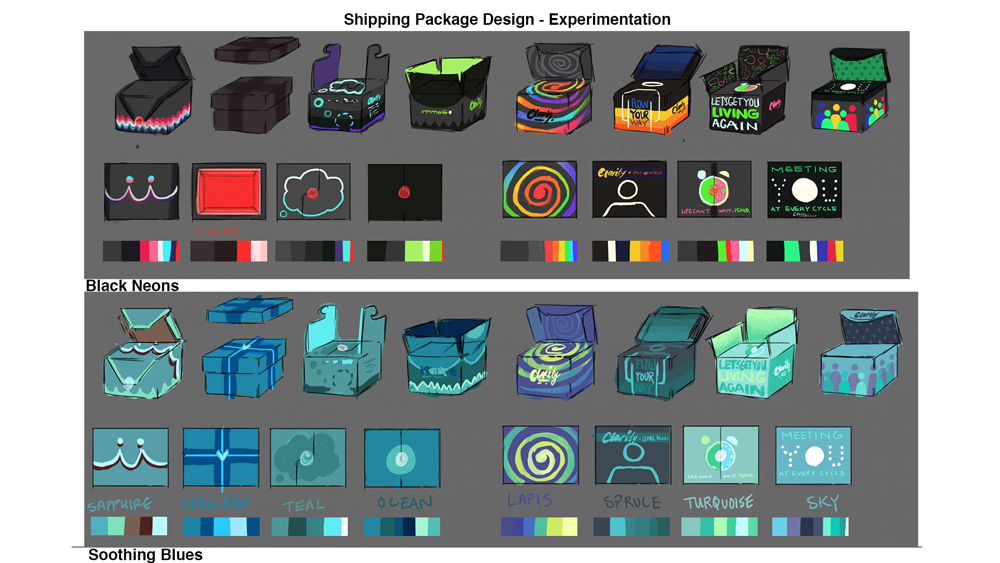
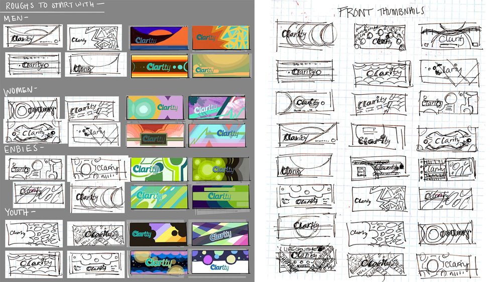
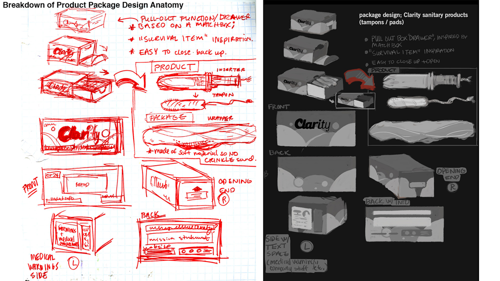
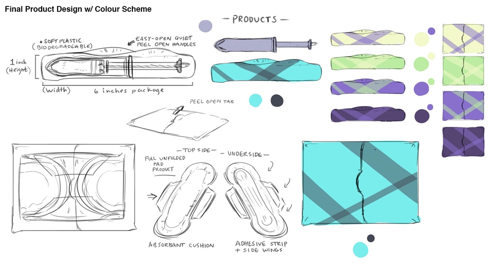
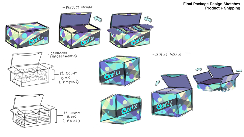
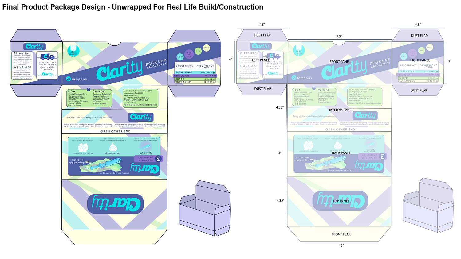
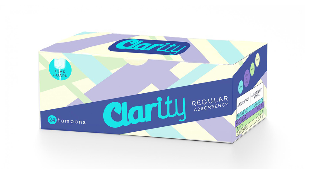
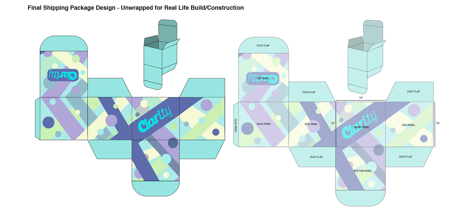
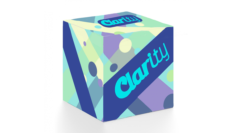
Package Design Process
 |
 |
 |
 |
 |
 |
 |
 |
 |
 |
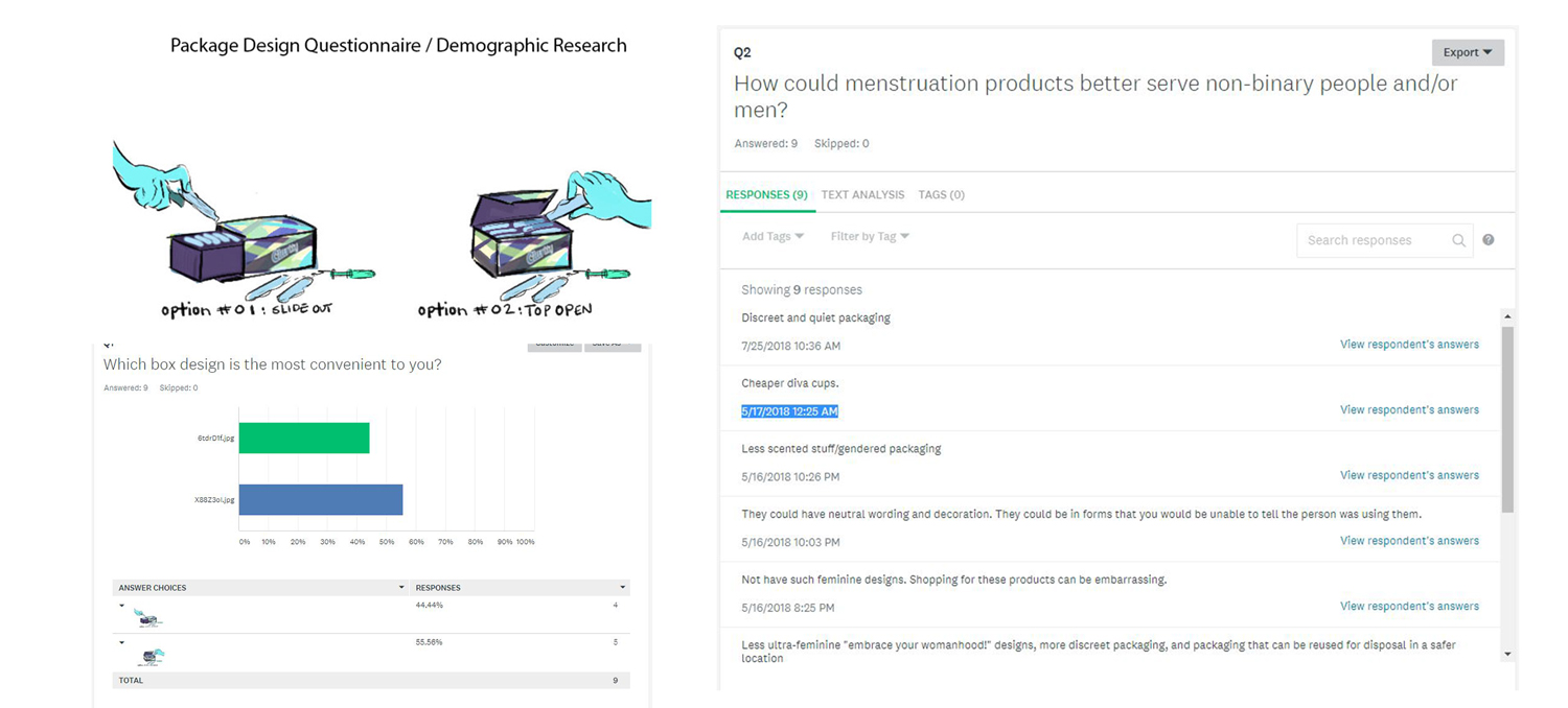
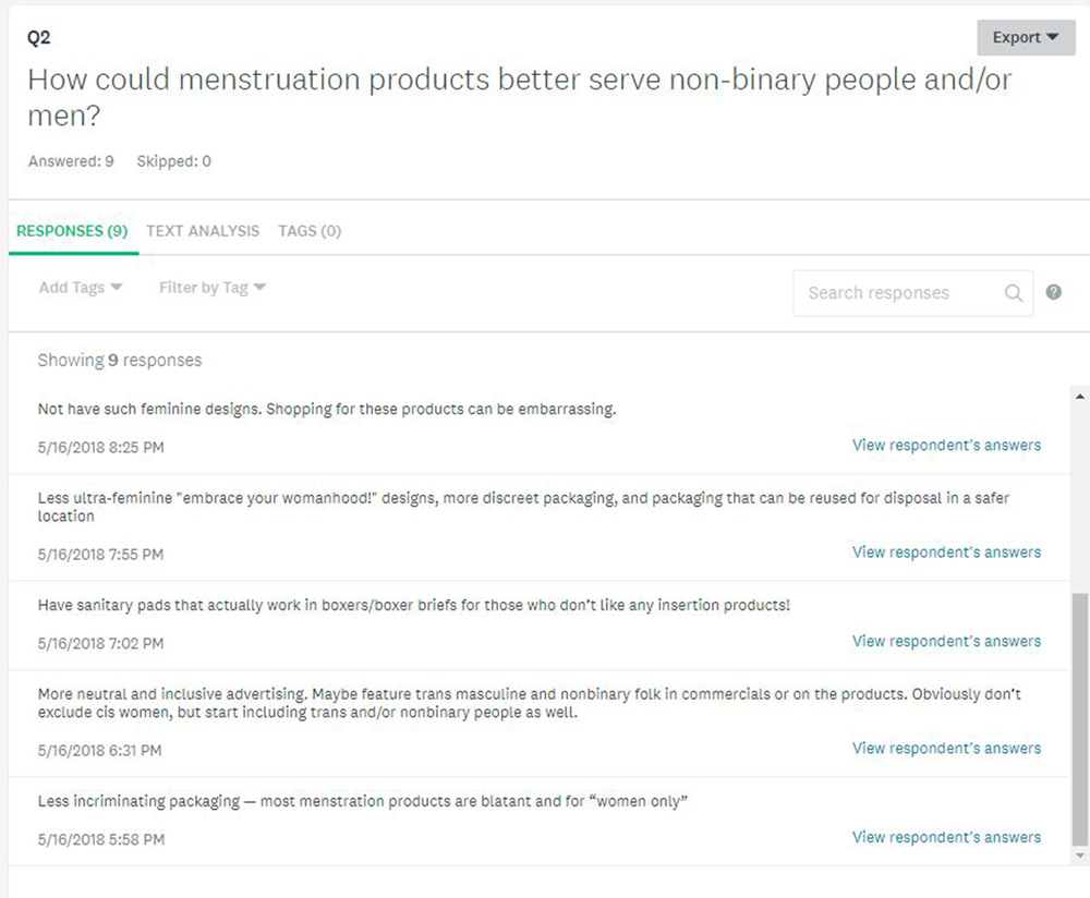
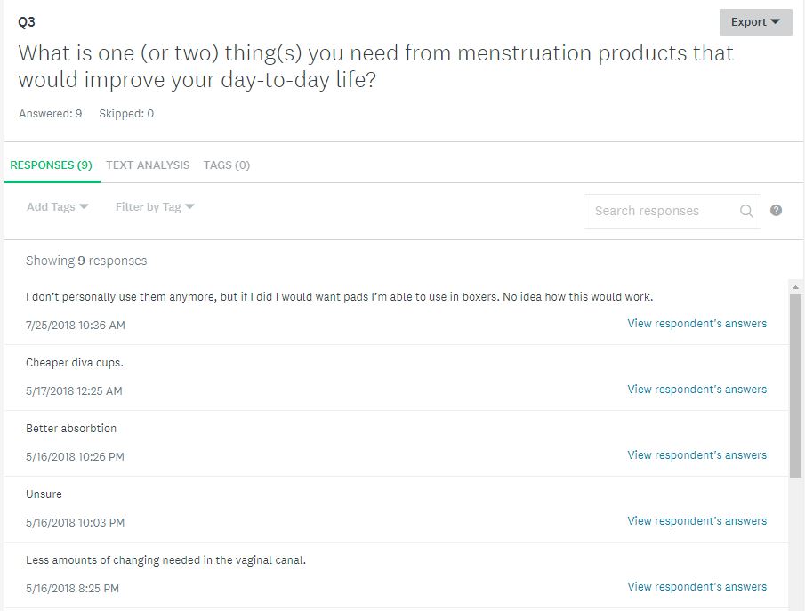
Survey and Demographic Research
| A necessary aspect of my project was proving that this demographic did in fact exist and that they needed the product I was planning on making. I asked multiple trans men, trans masculine and/or nonbinary individuals to fill out this survey with questions pertaining to period products. These are the results gathered: |
 |
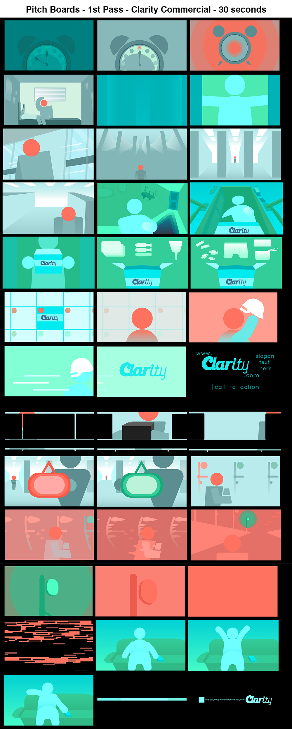
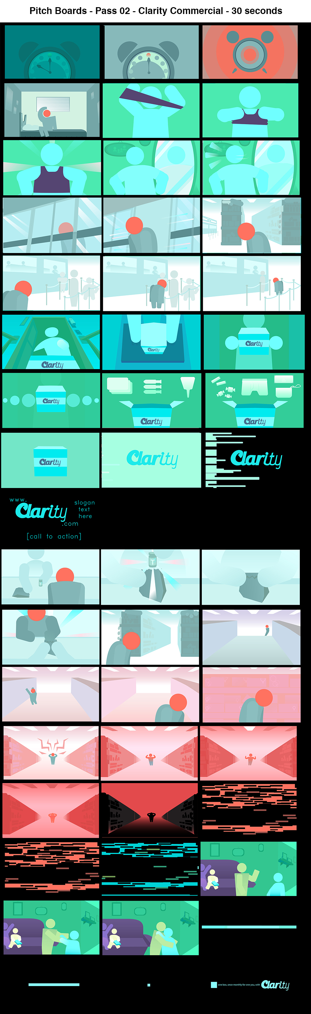
Pitch Boards
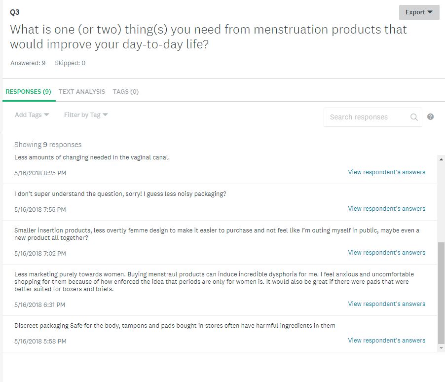
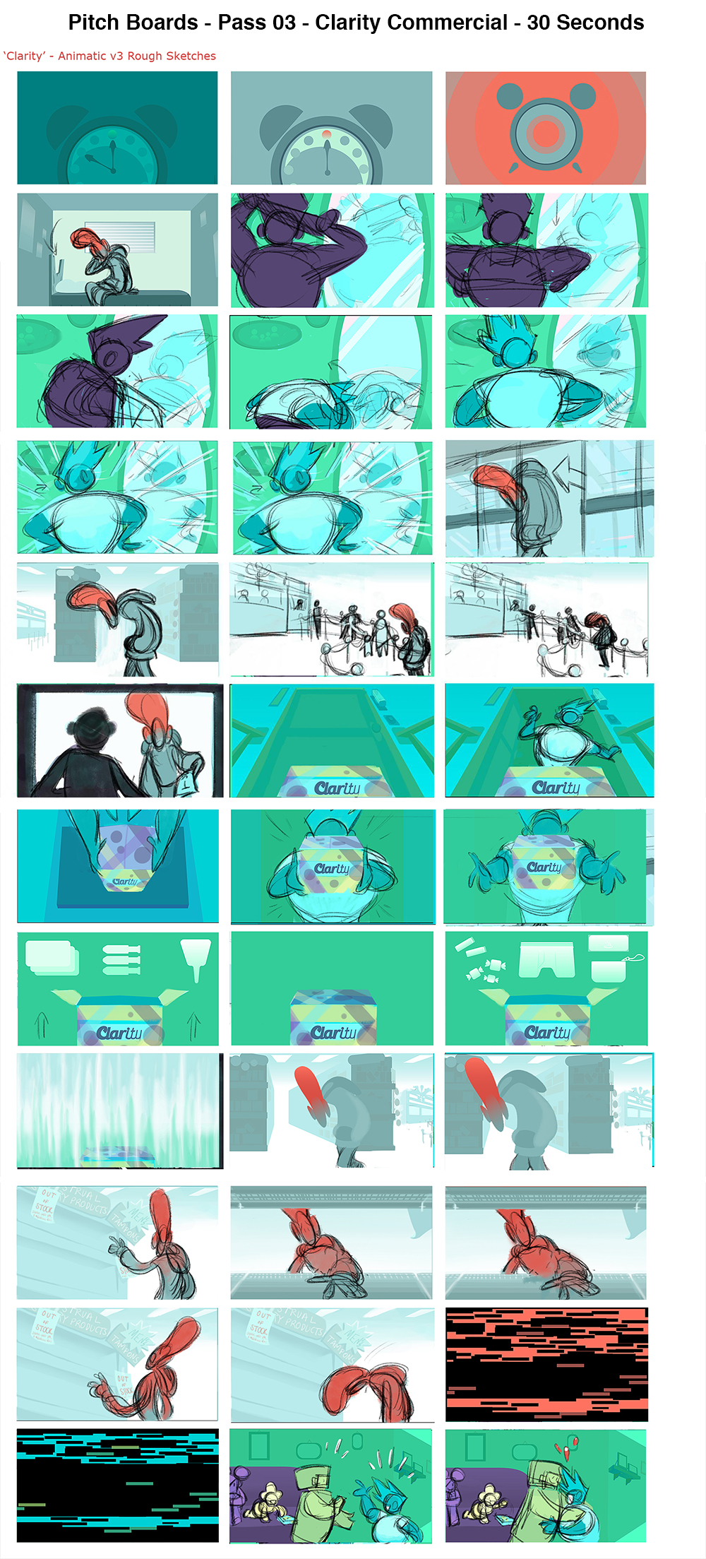
| The initial concept for the pitch is to promote the quality-of-life improvements that the Clarity at-home delivered period kit provides. I originally was going to do a split screen of the two different experiences, but that ended up being too much happening at once. The characters and their life experiences - one as a Clarity customer, one not - are denoted by separate colour palettes and have their own scenes that the viewer flips between. | |
 |
 |
 |
 |
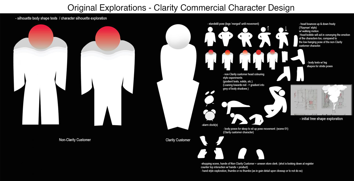
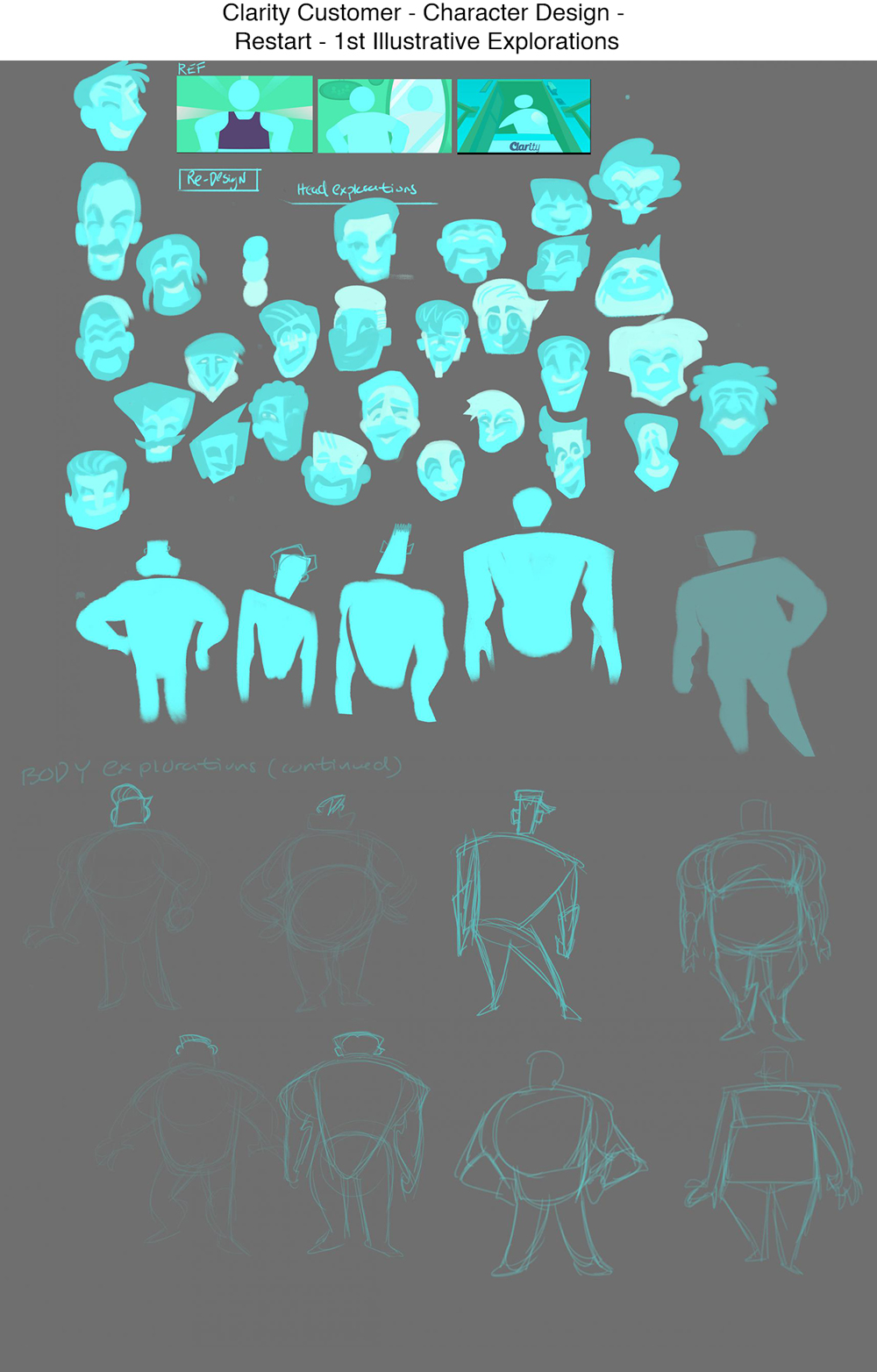
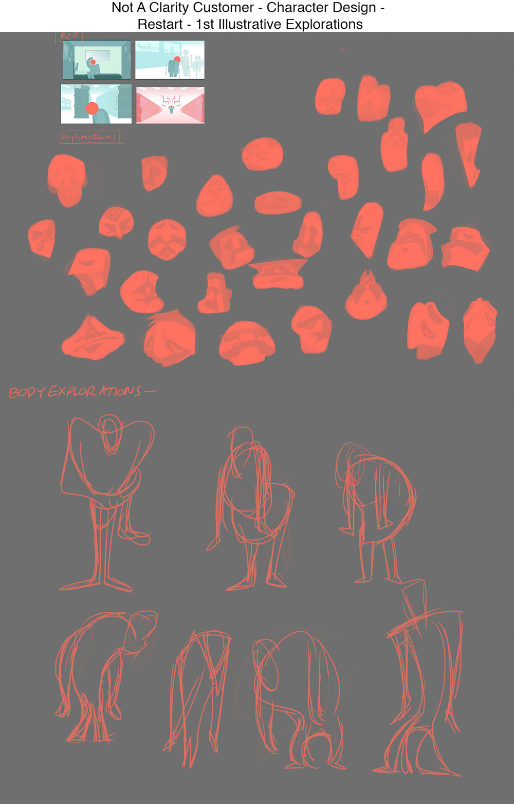
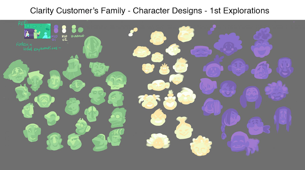
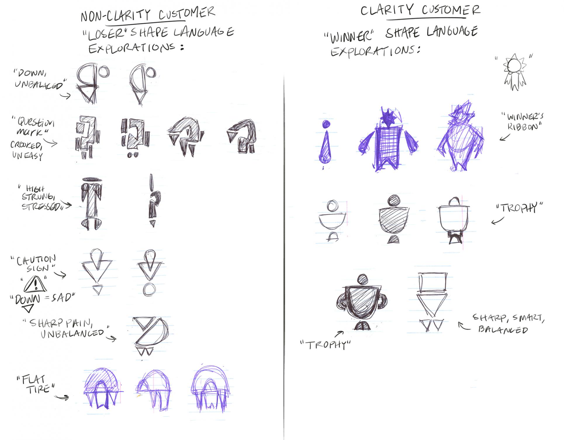
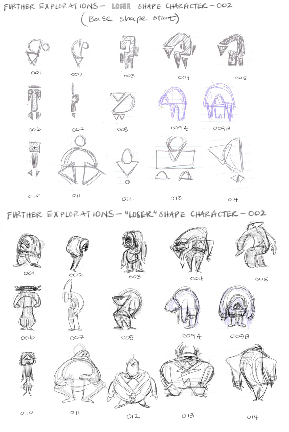
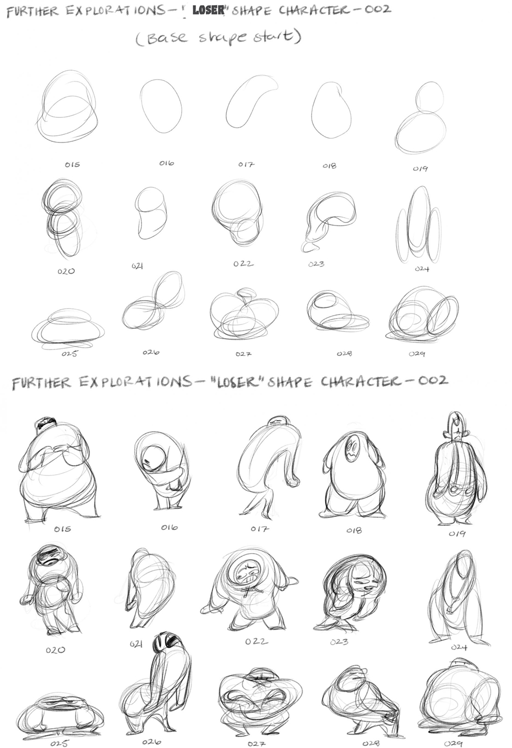
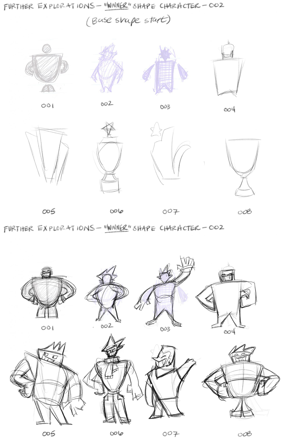
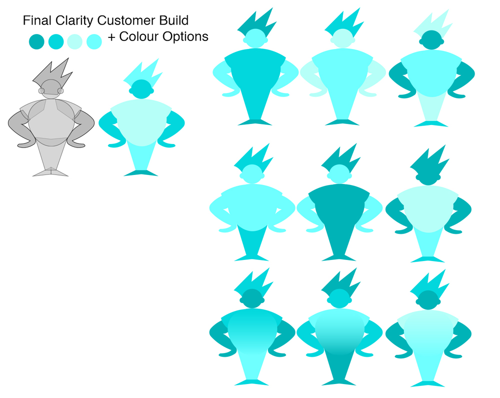
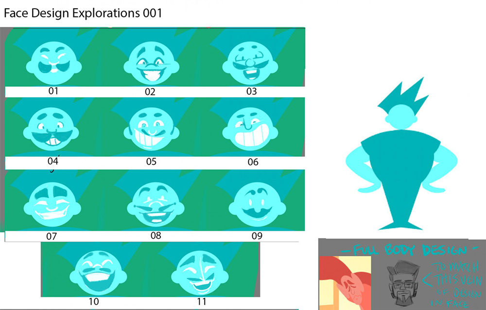
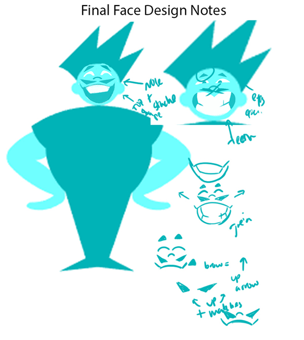
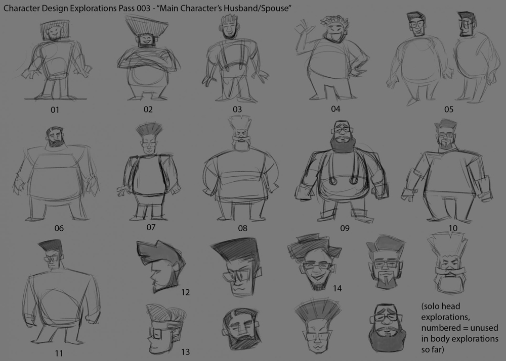
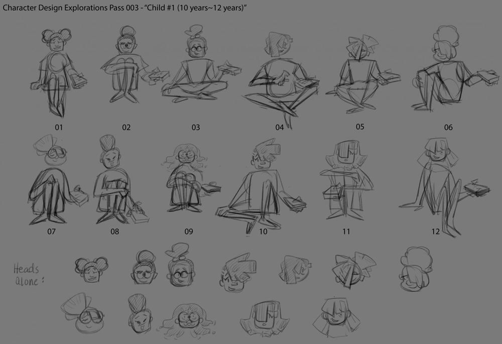
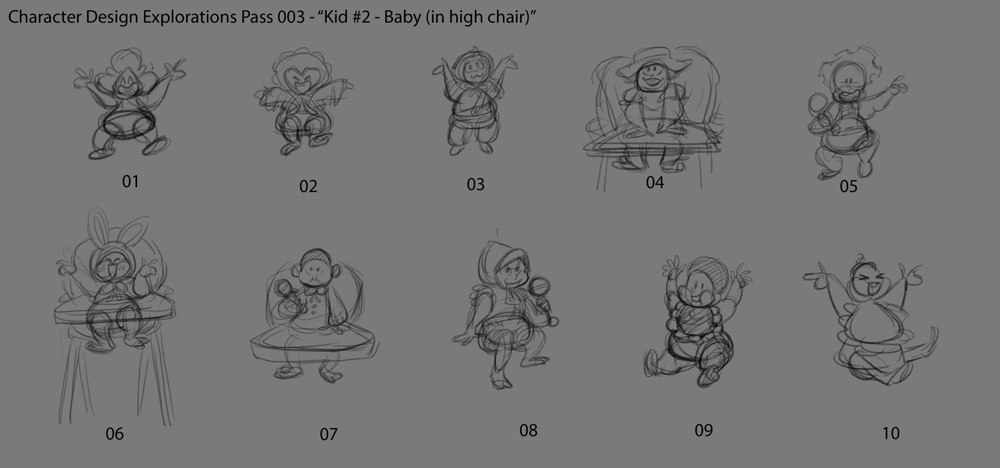
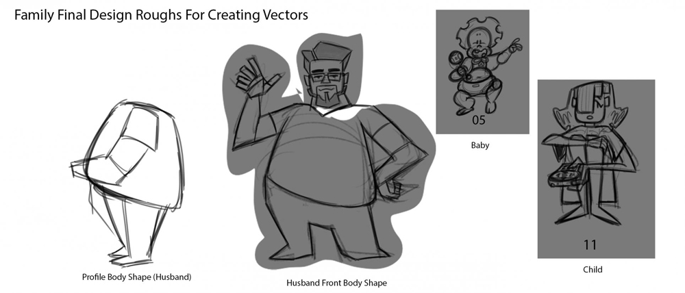
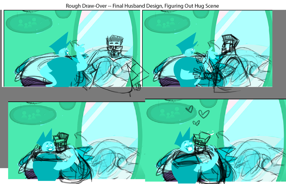
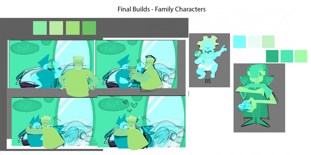
Character Design
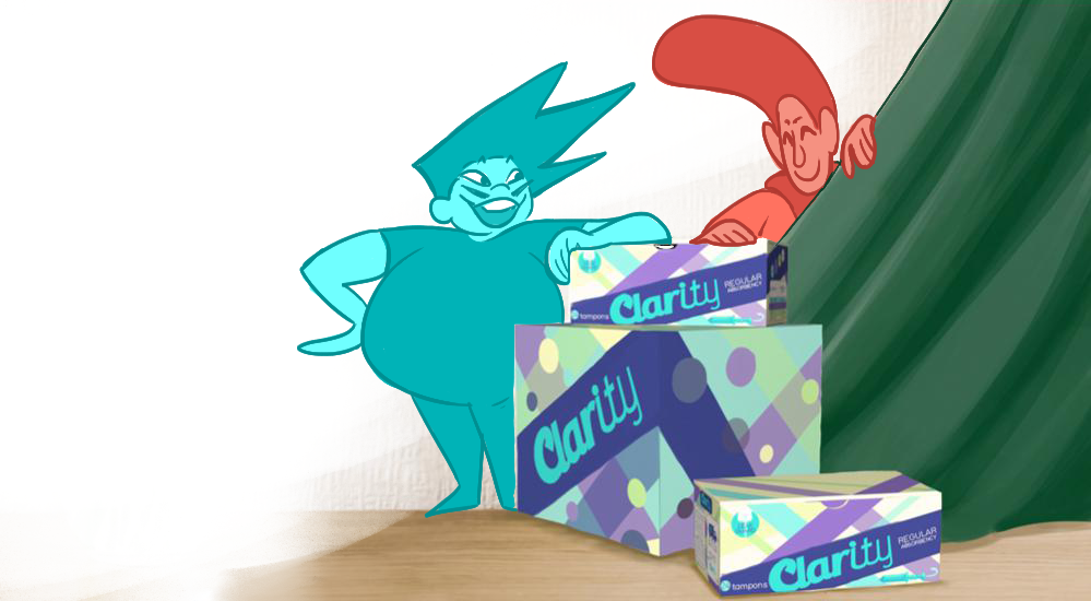
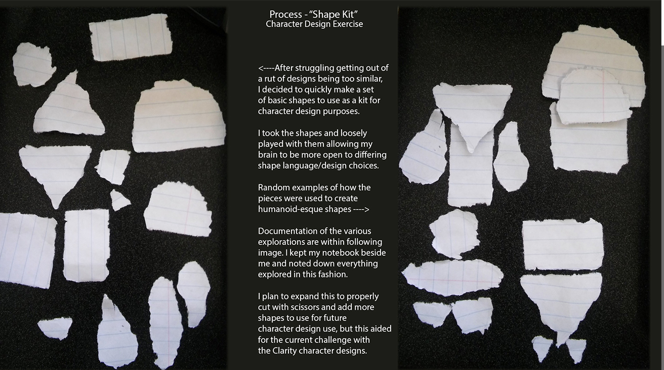
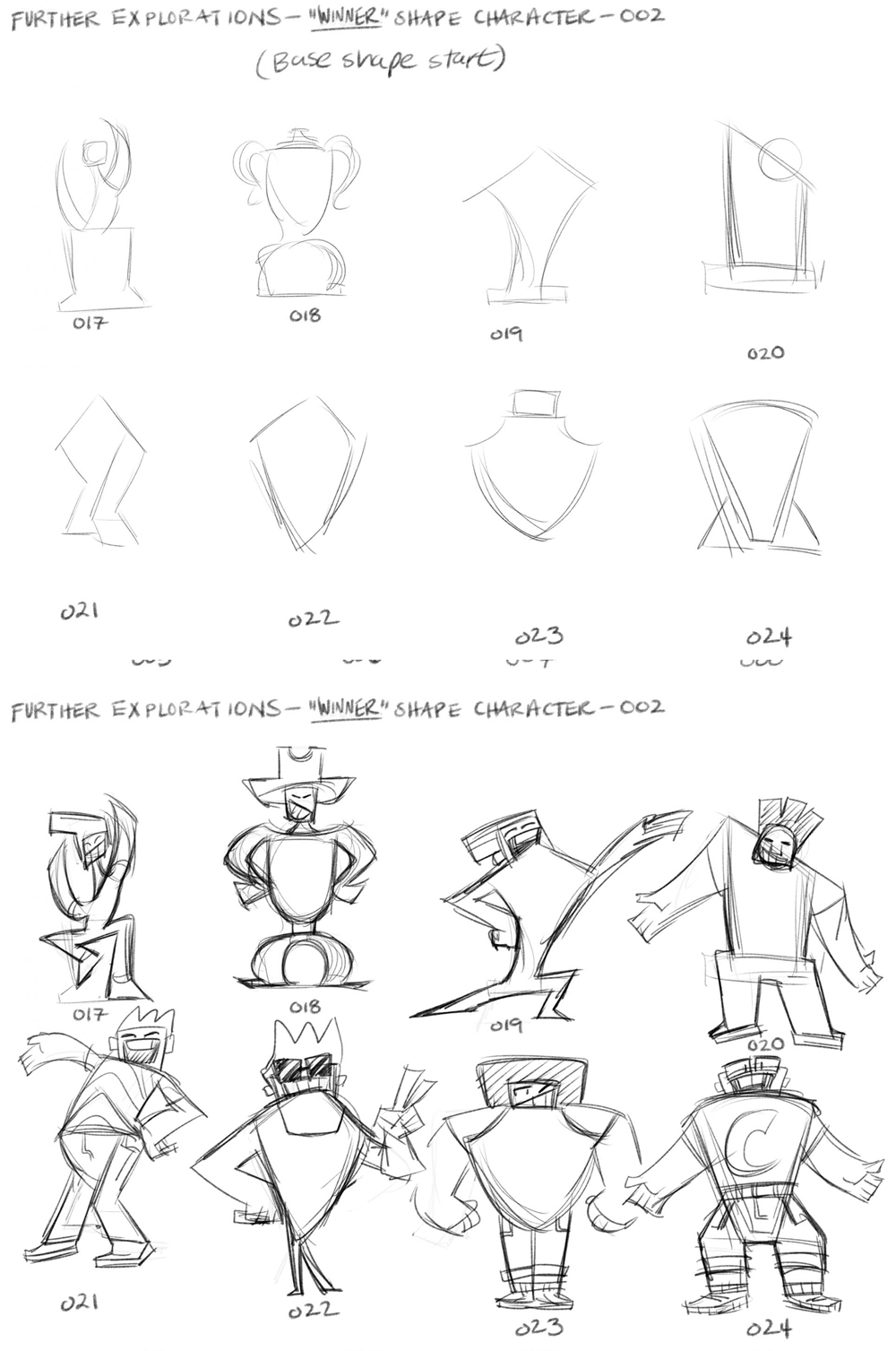
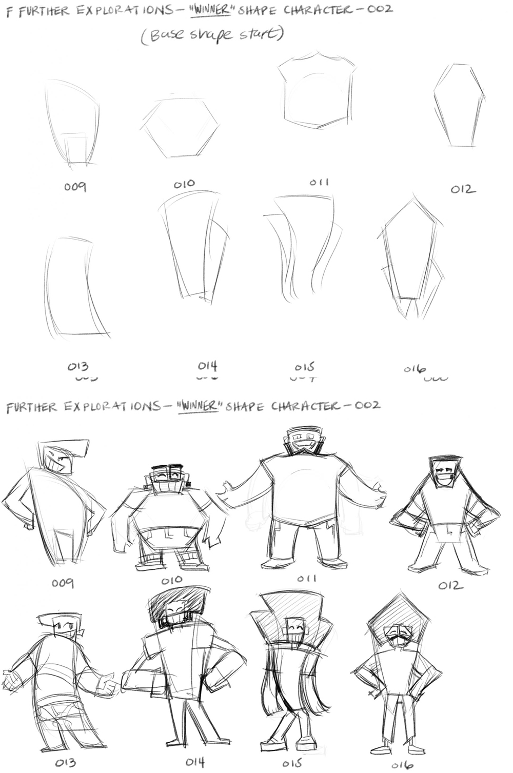
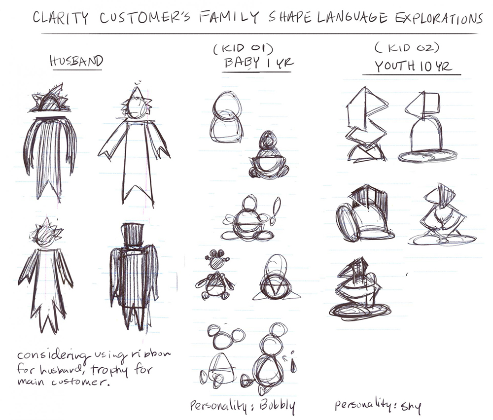
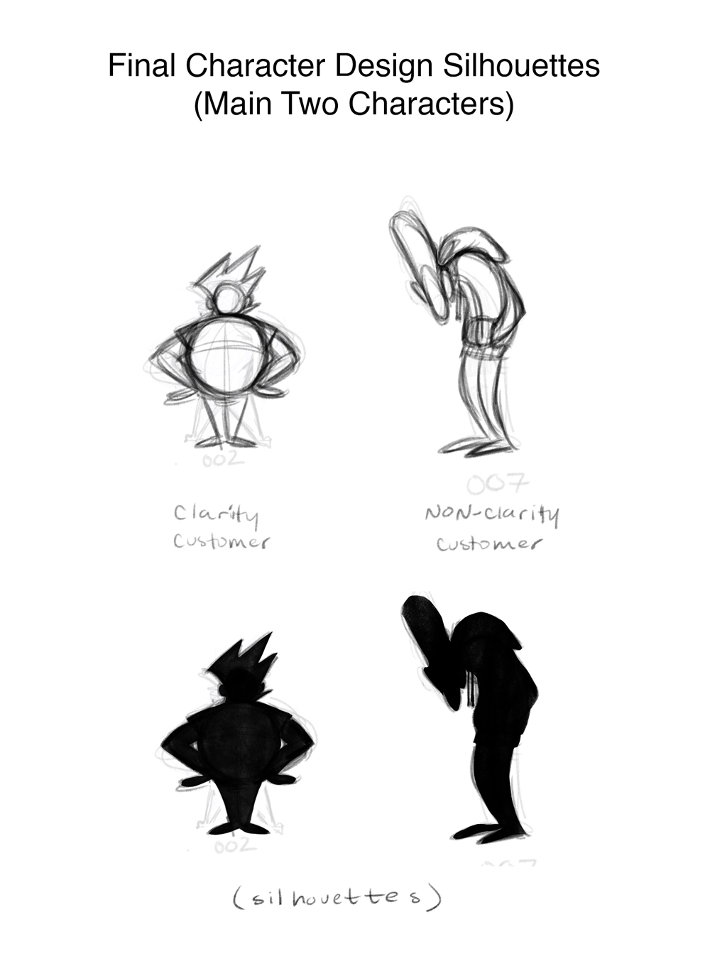
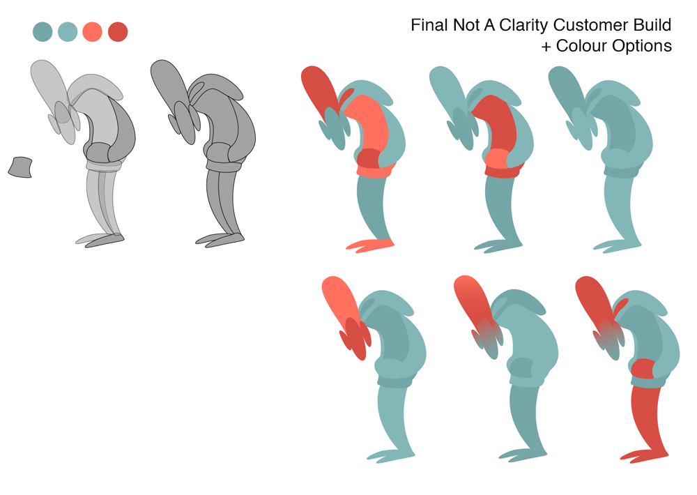
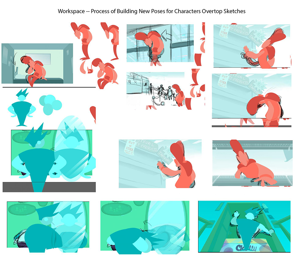
| The next step before I moved further with my animatic creation was to come up with some more identifiable characters, who were part of the demographic, relateable to the customer. I originally started with similar characters to the bathroom symbol people. On the second attempt I start out too illustrative, so I go back to ultimate basics by crafting a kit of basic shapes to play with (out of ripped paper because I was on campus at the time and needed something quick, I'd like to make a full real kit of shapes someday though) and explore different silhouettes to drive the ideation process further. Through this method, I come to the solution of a happy Clarity customer and a miserable person who isnt benefiting from Clarity's services. | 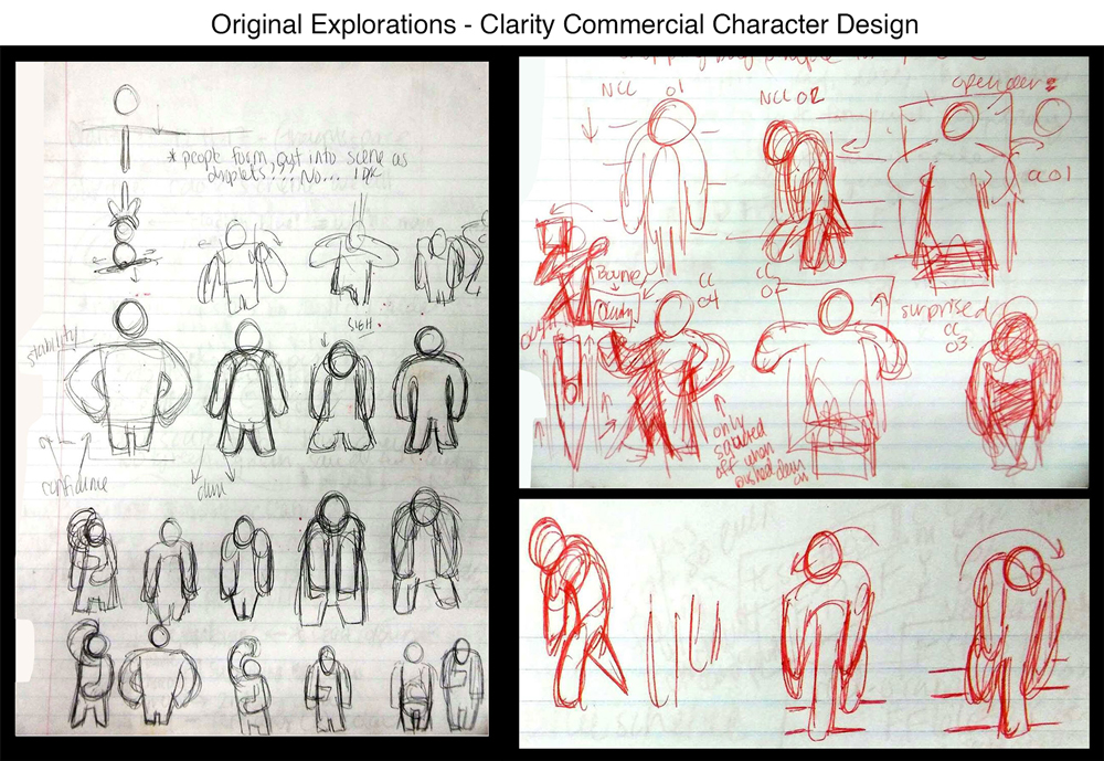 |
 |
 |
 |
 |
 |
 |
 |
 |
 |
 |
 |
 |
 |
 |
 |
 |
 |
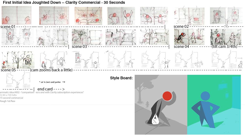
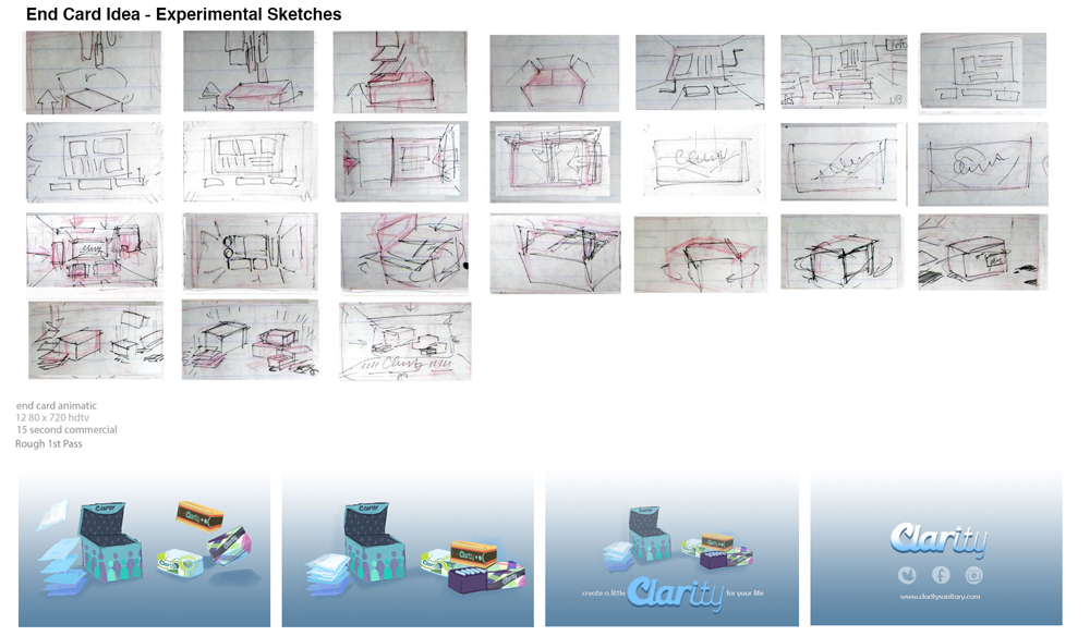
Animatic
'Clarity' - w/ Music - ROUGH Sketch Animatic - 30 sec from Orion Schiada on Vimeo.
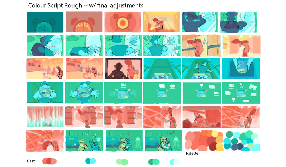
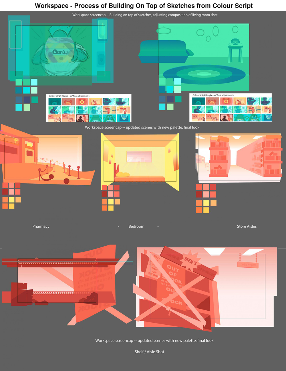
Colour Script
Extra Process
 |
 |
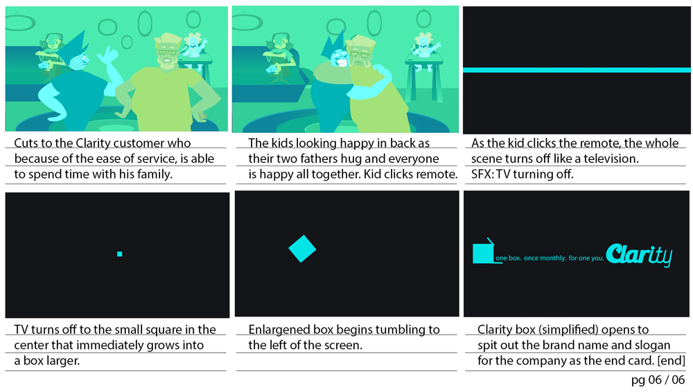
Final Storyboards
Collateral
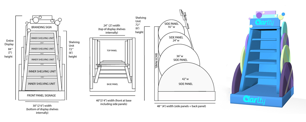 |
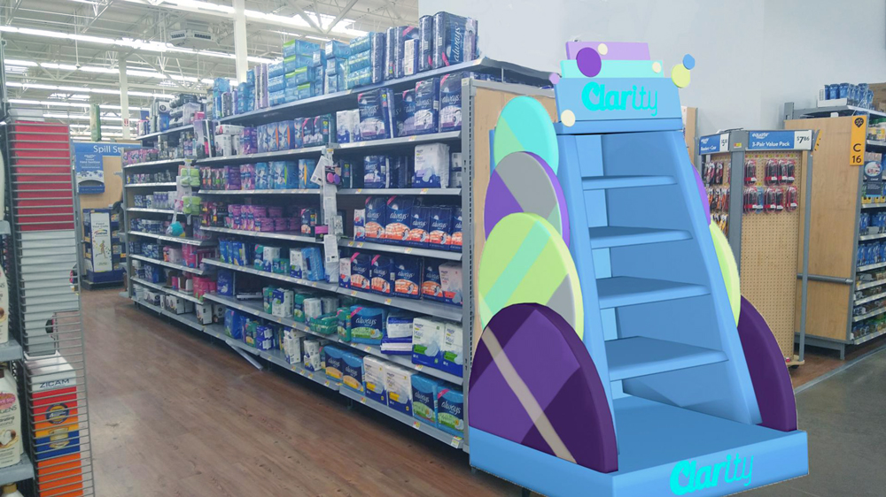
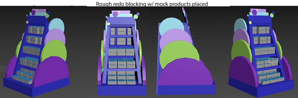
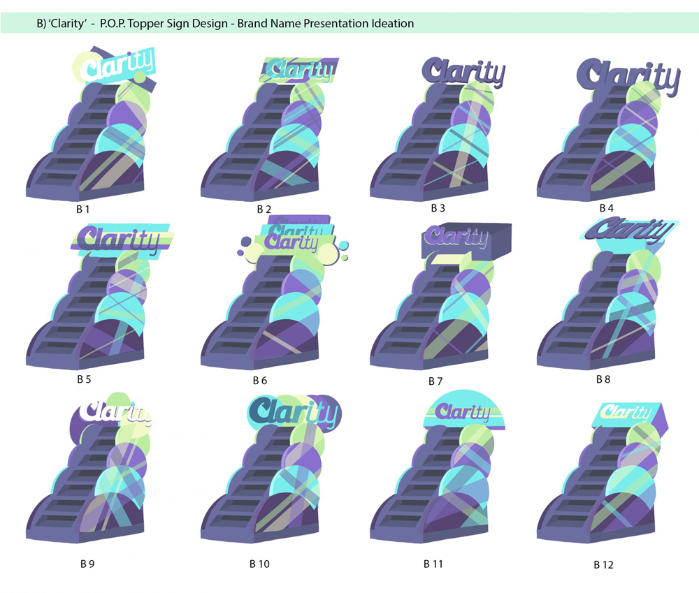
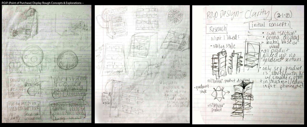
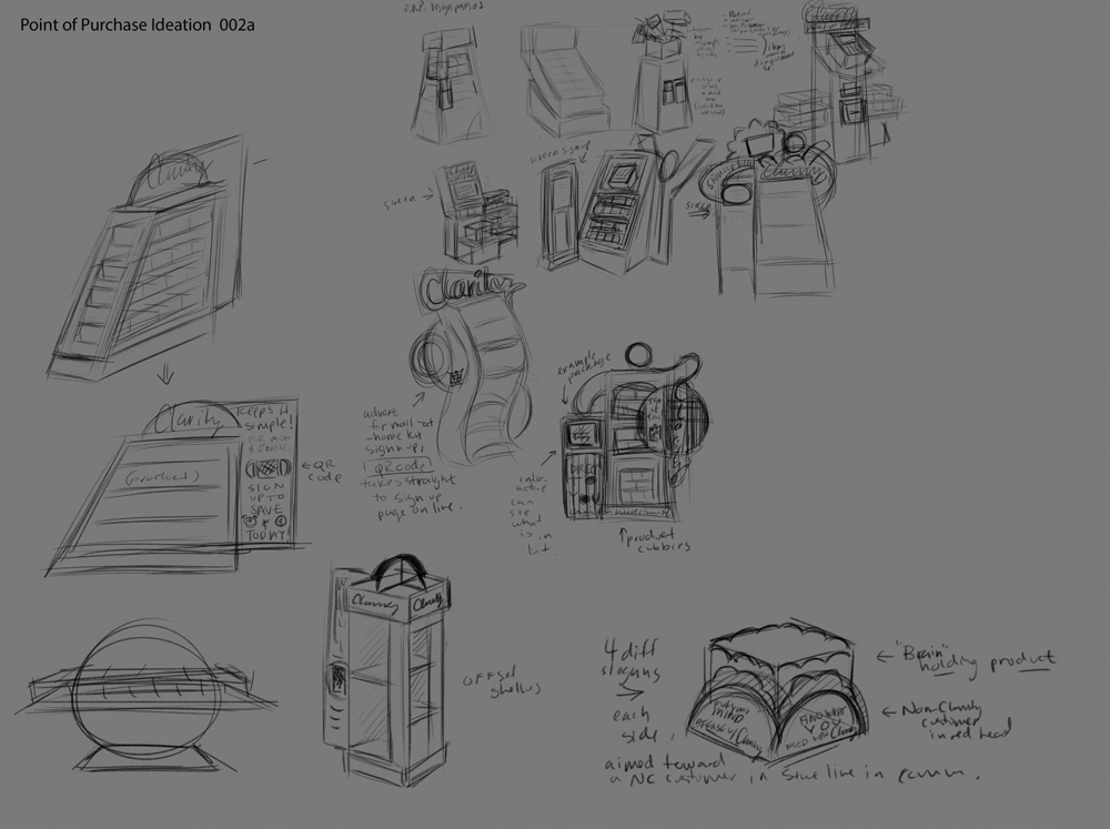
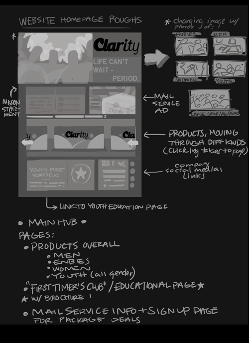
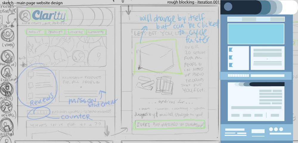
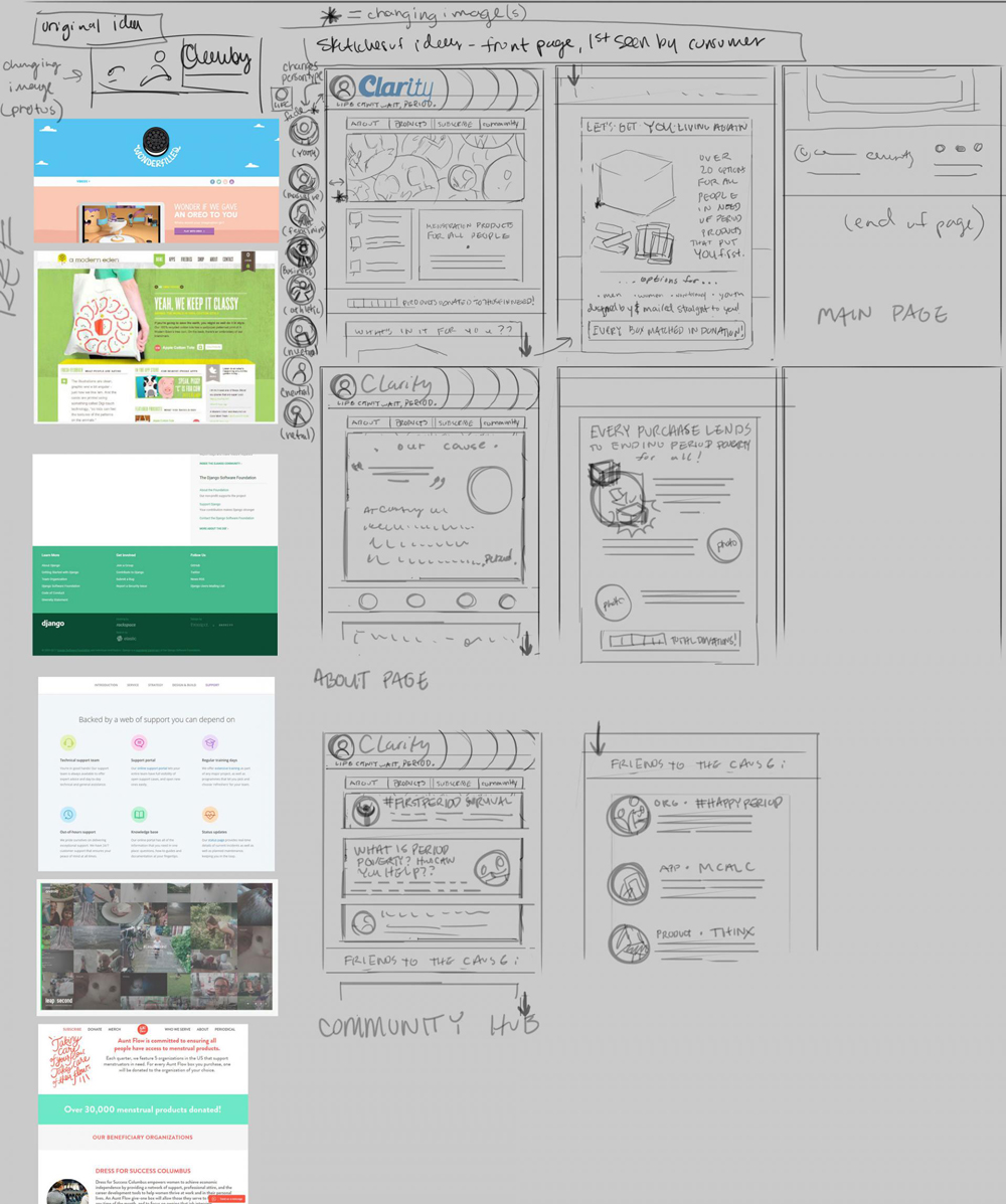
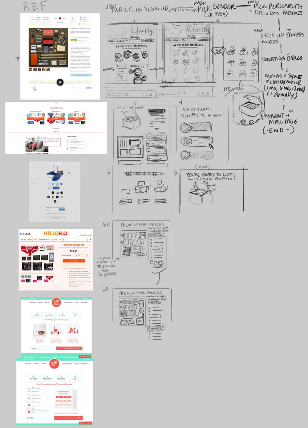
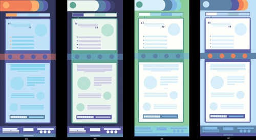
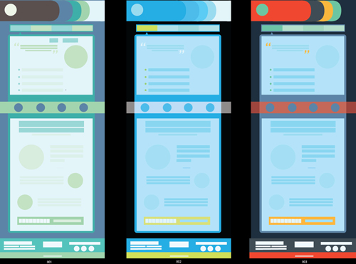
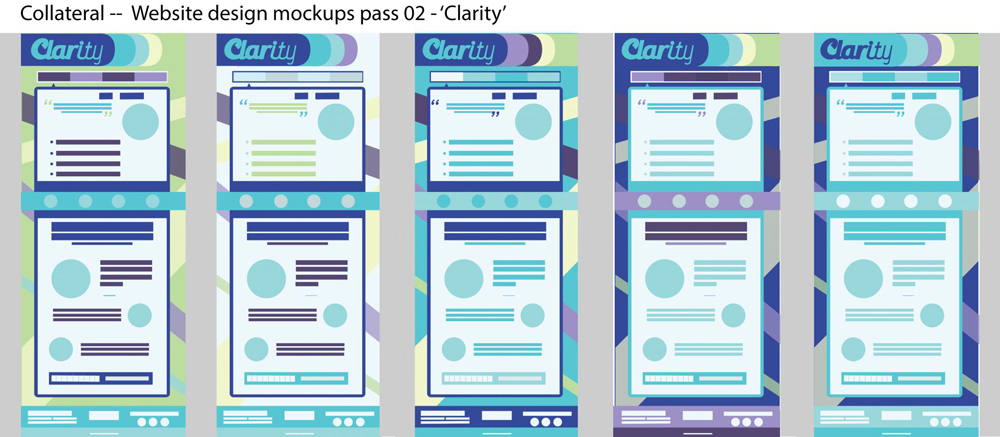
The three collateral pieces included within this campaign project include the package design posted up above, a Point of Purchase display (P.O.P.), and a website design. The process behind each is here. For the P.O.P., we wanted to go for an approachable design that would live at the end of a period products aisle where it would be possible to shop at it without entering the aisle itself and causing discomfort from having to be around the feminine designs in the aisle itself. We wanted to keep the Clarity experience all it's own. |
 |
 |
 |
 |
 |
 |

 |
 |
 |
 |
 |
 |
Thank you for your time looking at my project today!
[Return To Top]

Sign-up for our weekly newsletter 'MONSTROUS MEMOS' from Ovaettr Art & Zine Distro!
Keep up to date on all our work! New sign-ups get a Free PRINTABLE Zine Pack!